Fronteiras
Zet Gallery - Braga
19/07/2024 - 21/09/2024
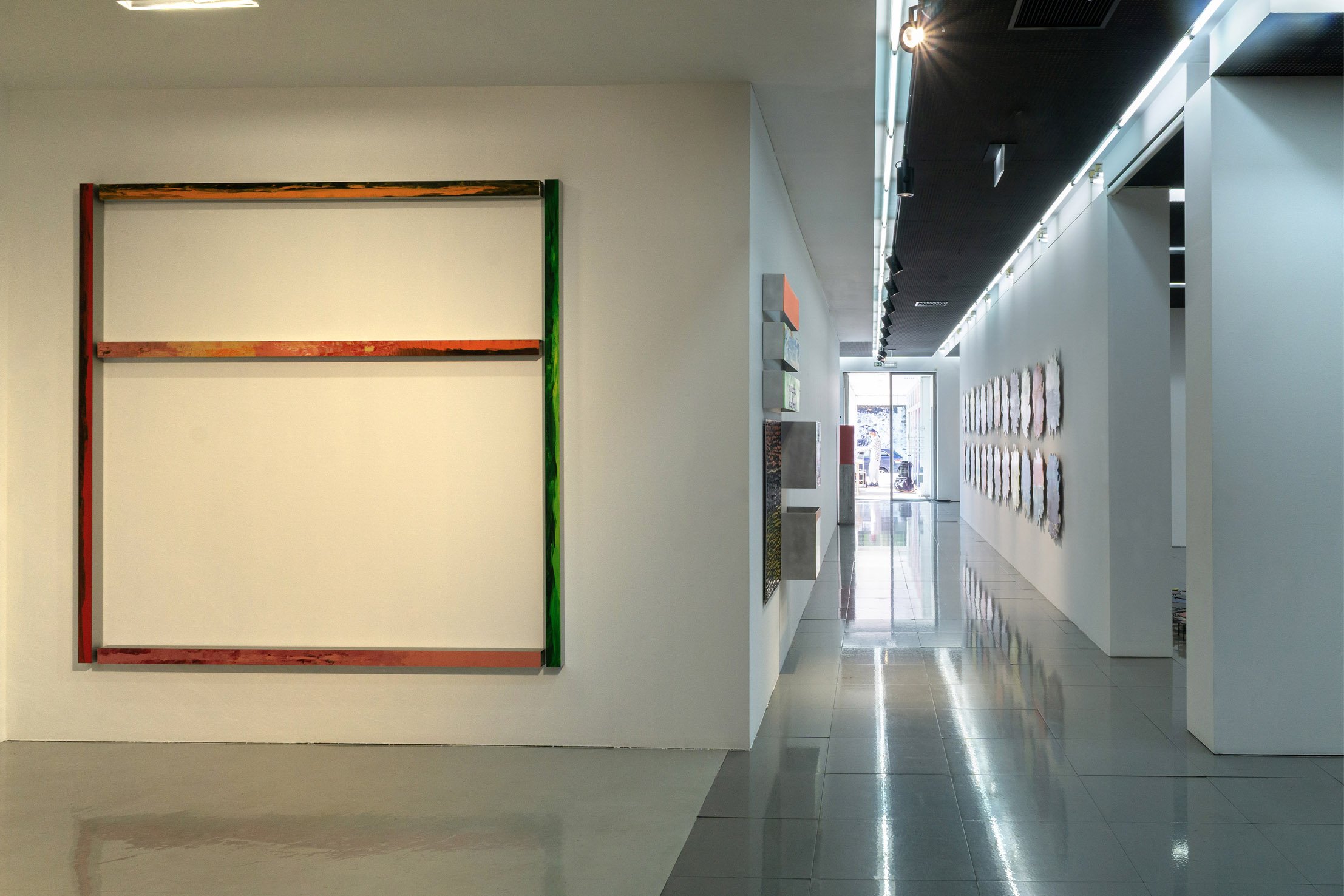
[EN]
(PT below)
Light in the half-shadow
by Pedro Calapez
Light, shadow, as if we were walking between these two extremes in which a work slips or reveals itself,
a system of programmatic enunciations in an endless back and forth. I’m not going to be clear, I don’t
wish to be. I want to give painting the chance to deceive, the chance not to give the answer that the eye
desires, the certainty that it can be something other than what the shapes and colours appear to be. When we talk about light, we’re faced with something not very specific, something that doesn’t tell us whether the light is intense white, in stark contrast to (any) other colour, or just the soft glow of a penumbra. But why is the notion of contrast always so decisive in the artistic object?
Other pairs of opposites are useful in my work. It seems to be a process that not only helps me reveal
a work that at one point I thought was finished, but also leads to benchmarking processes, calling
everything into question.
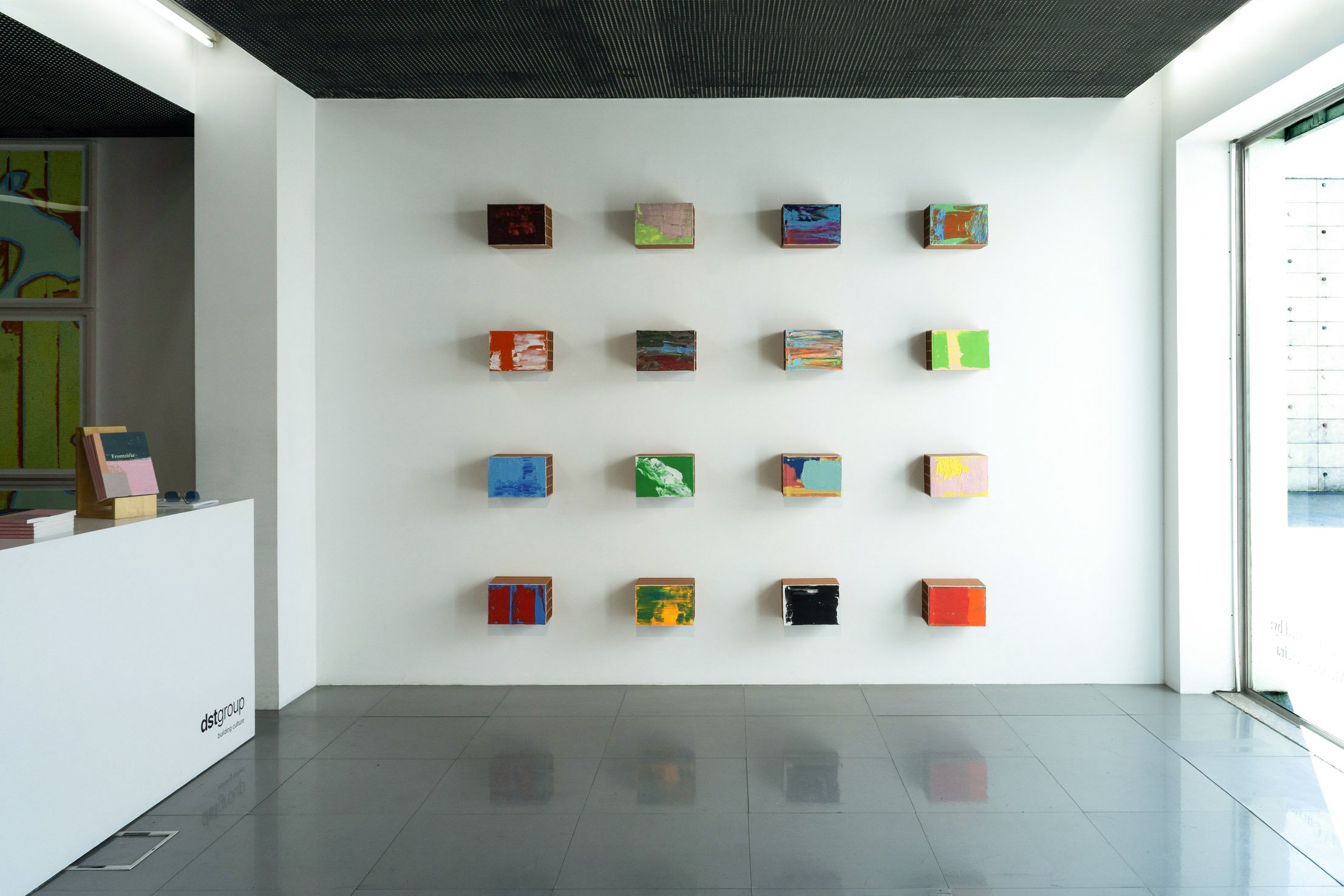
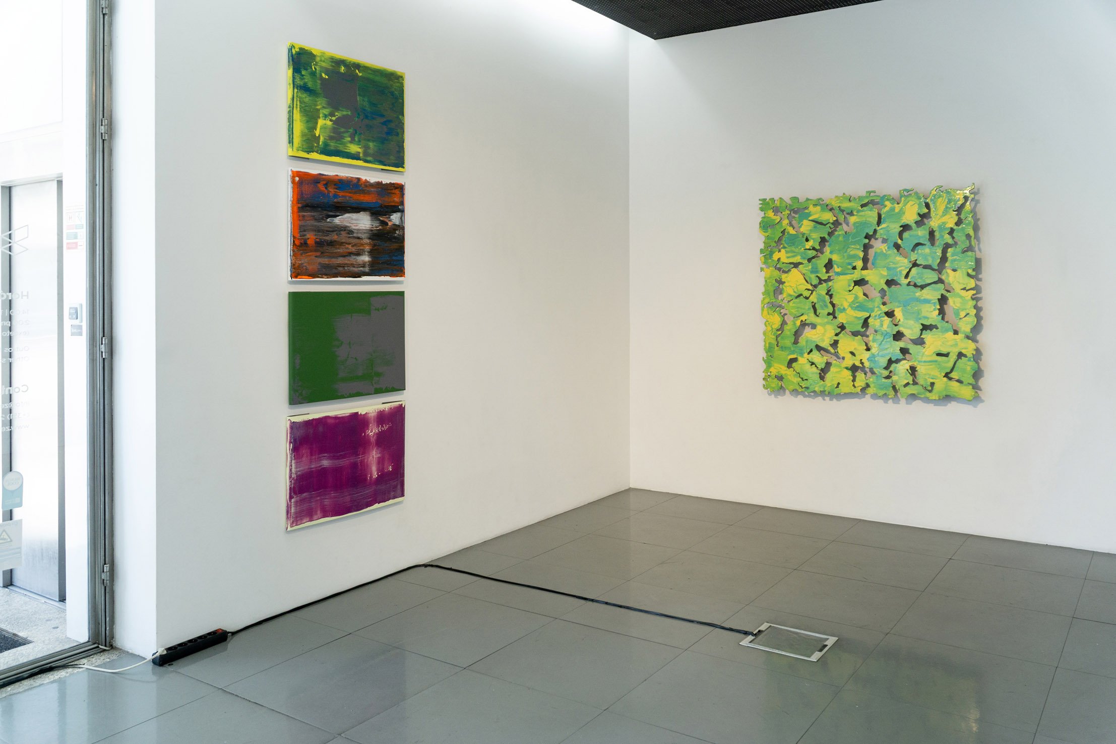
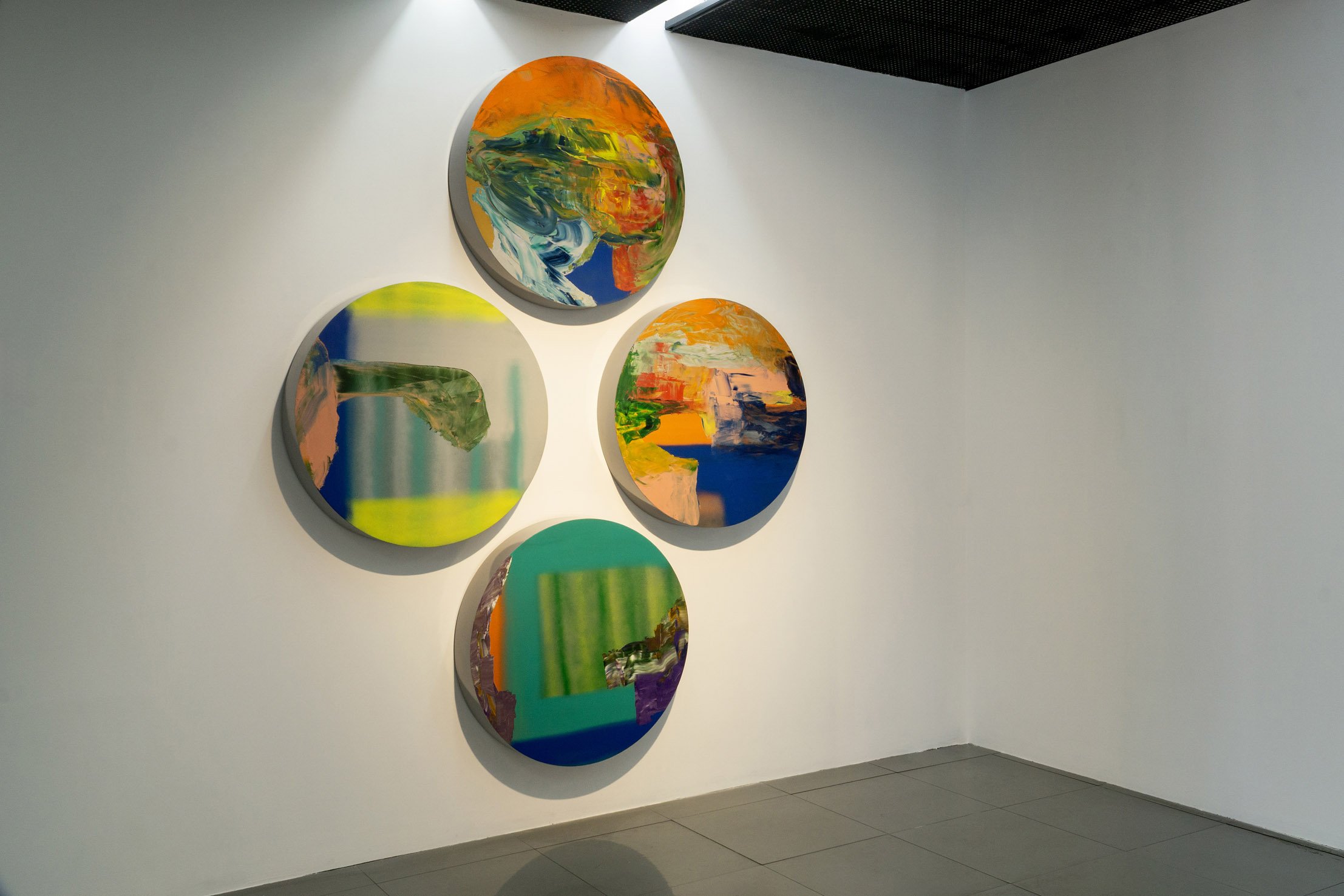
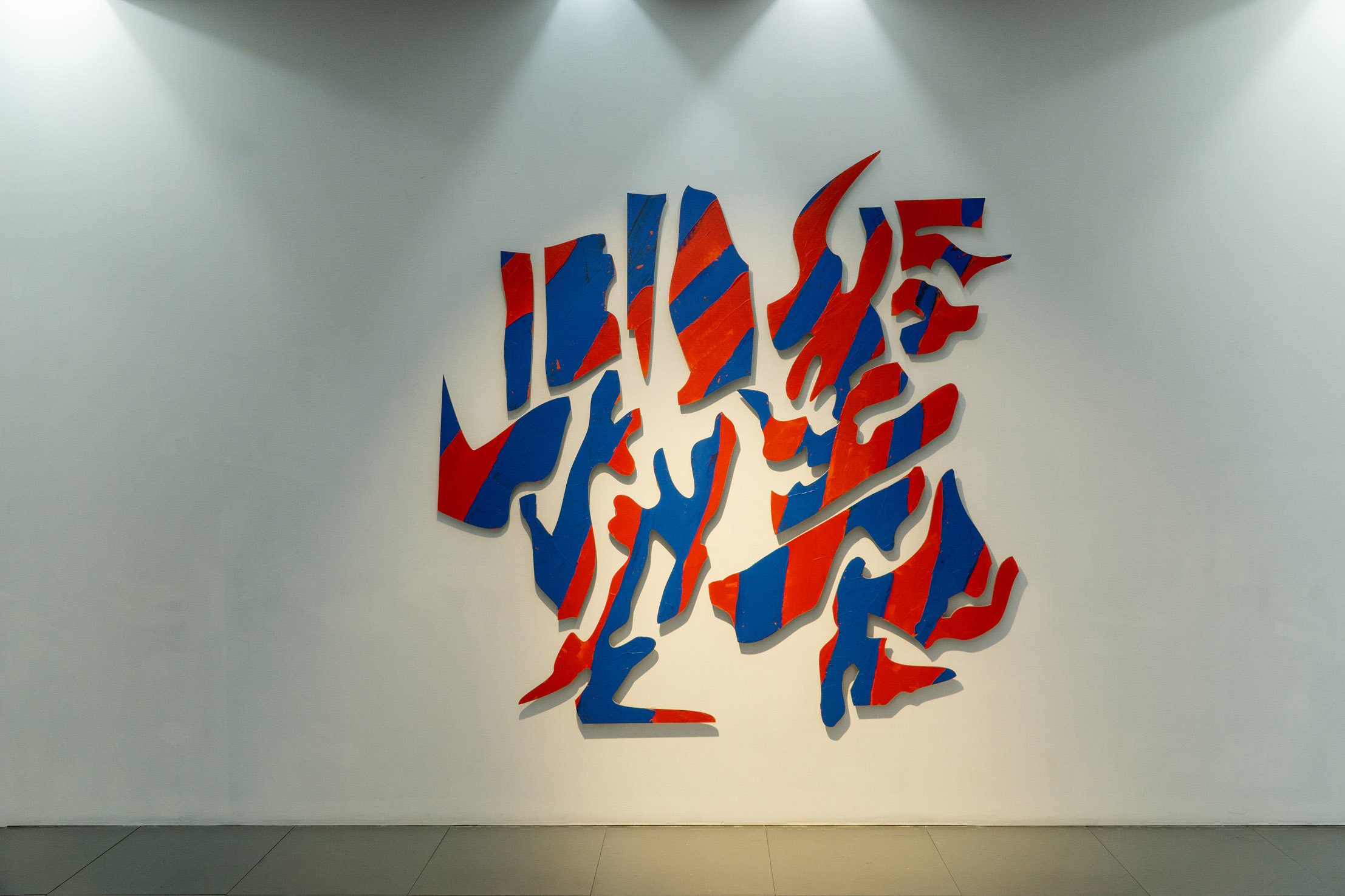
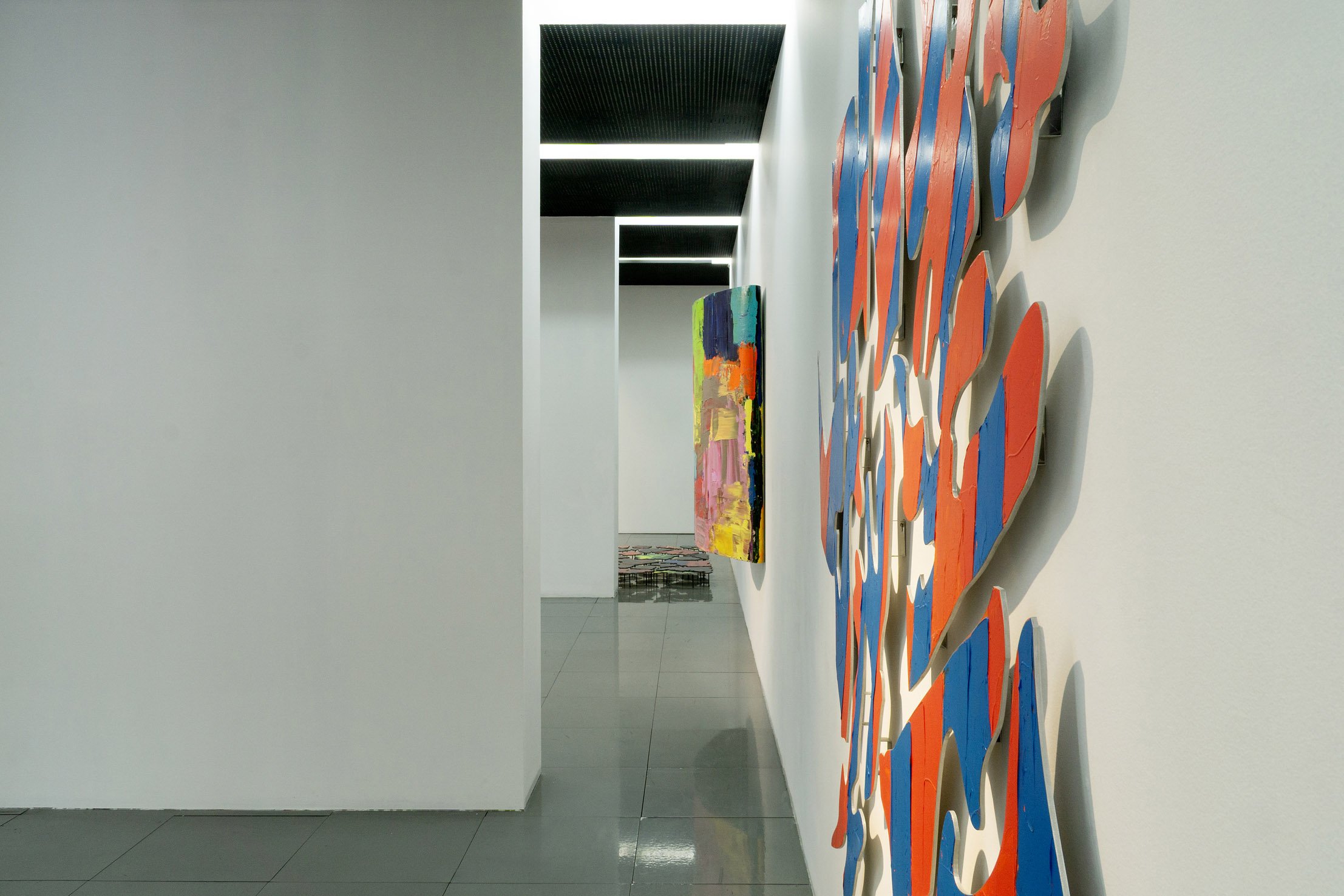
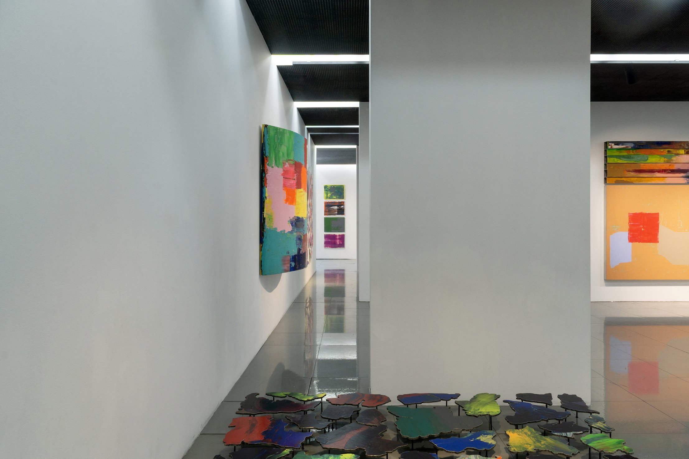
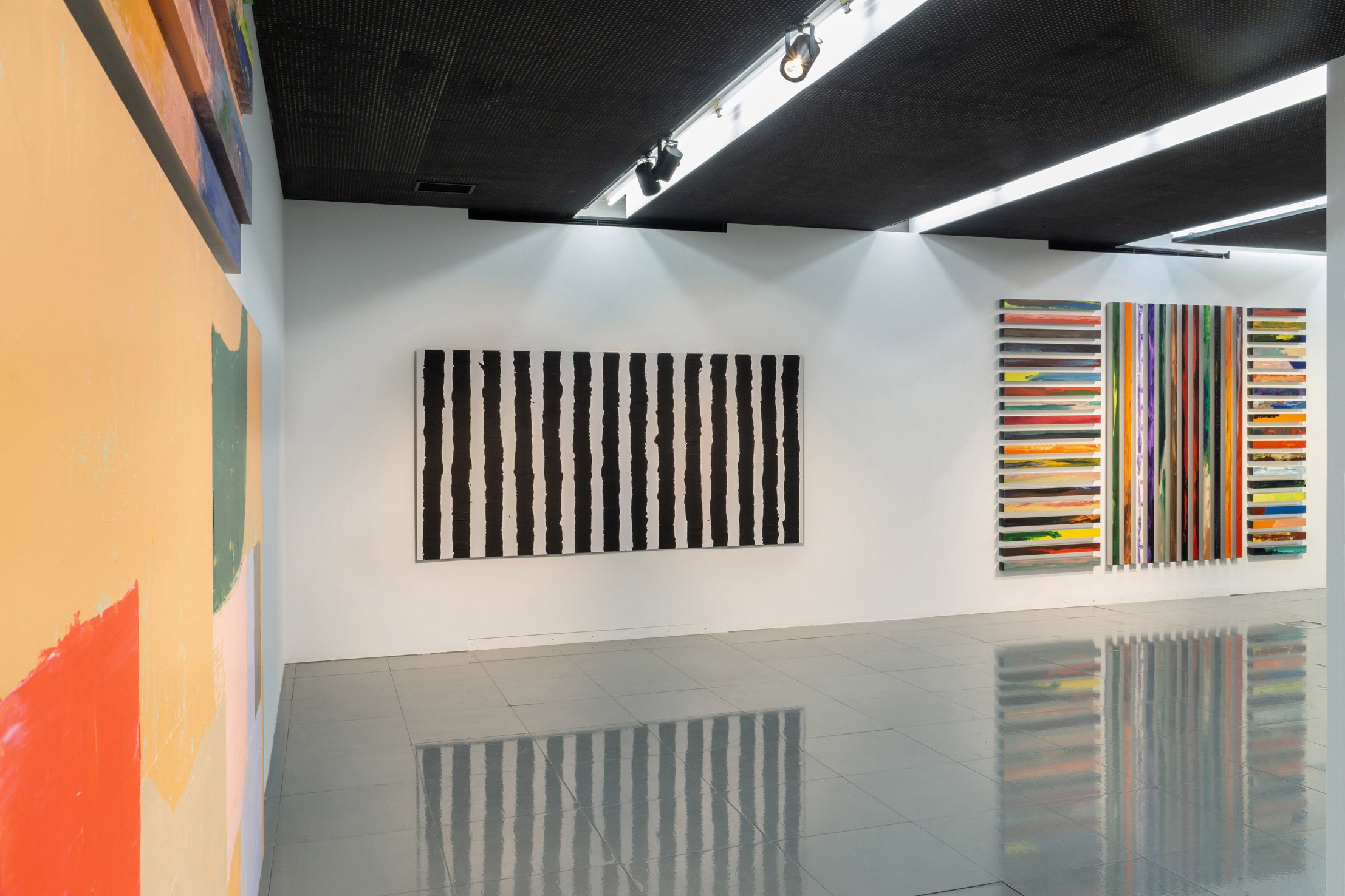
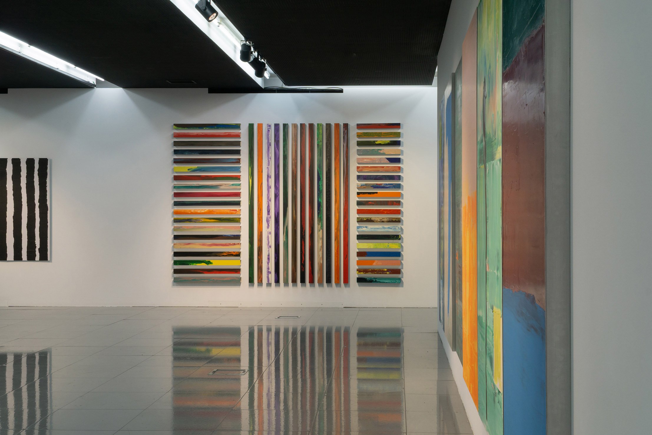
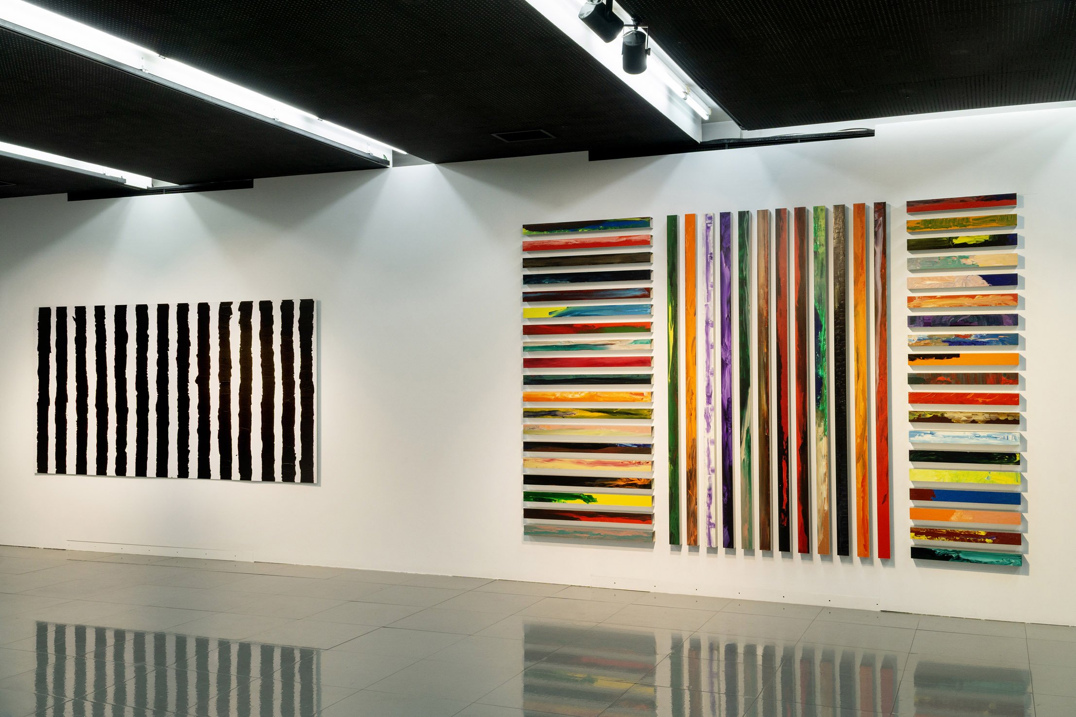
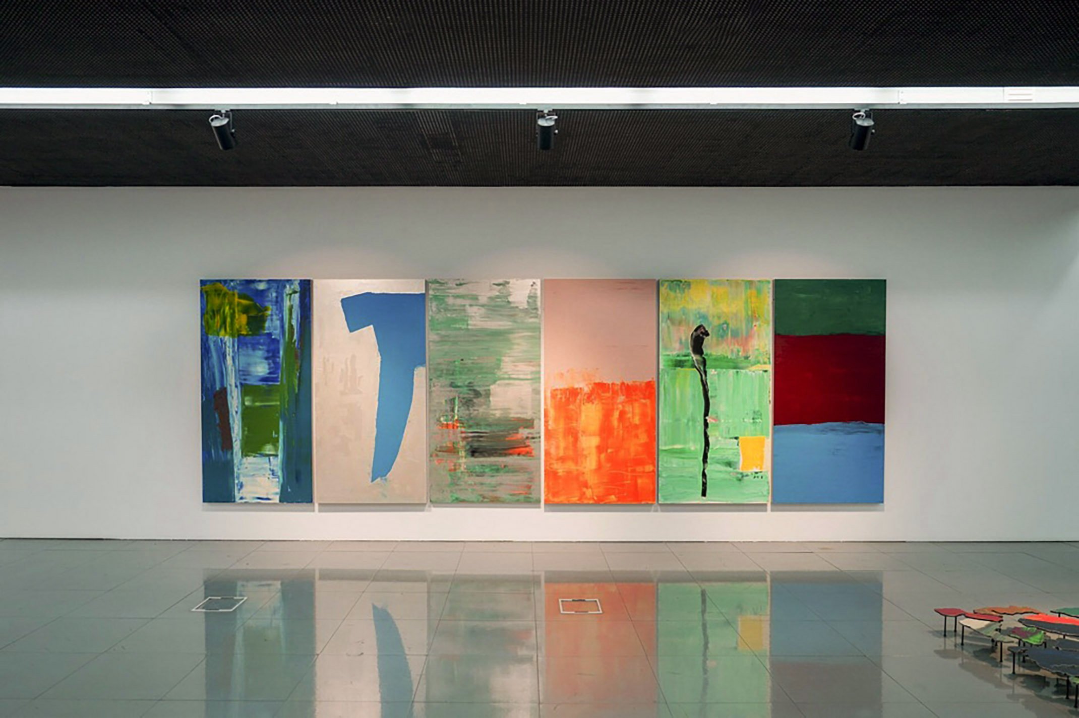
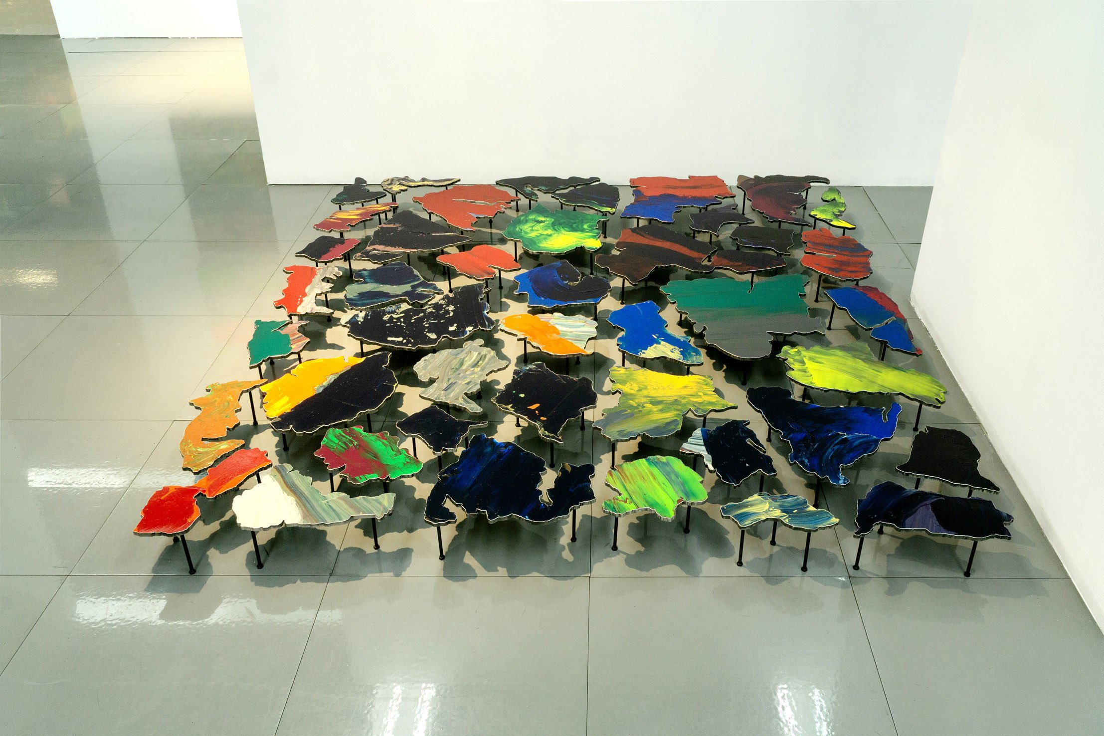
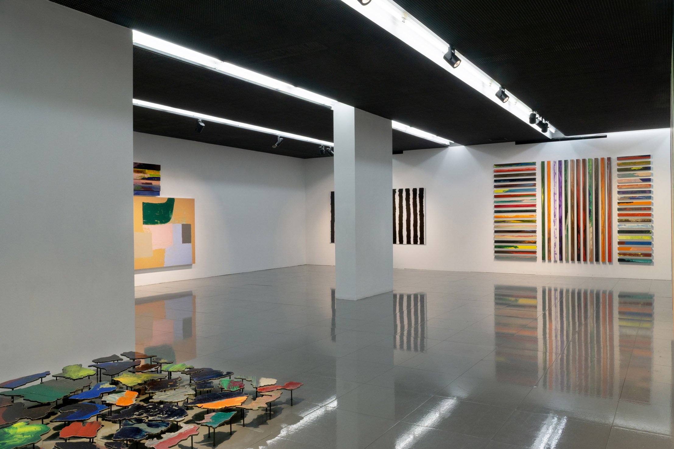
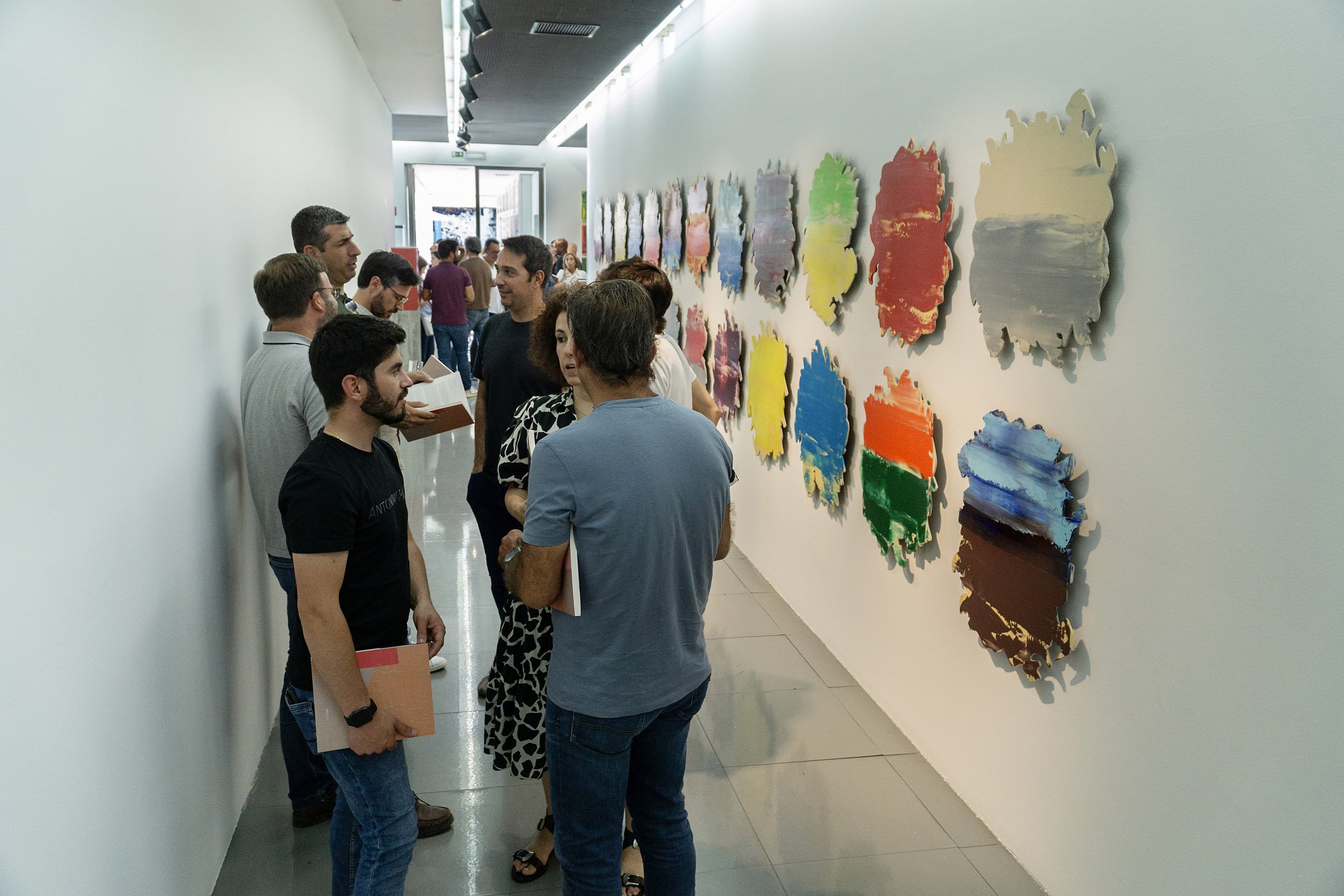
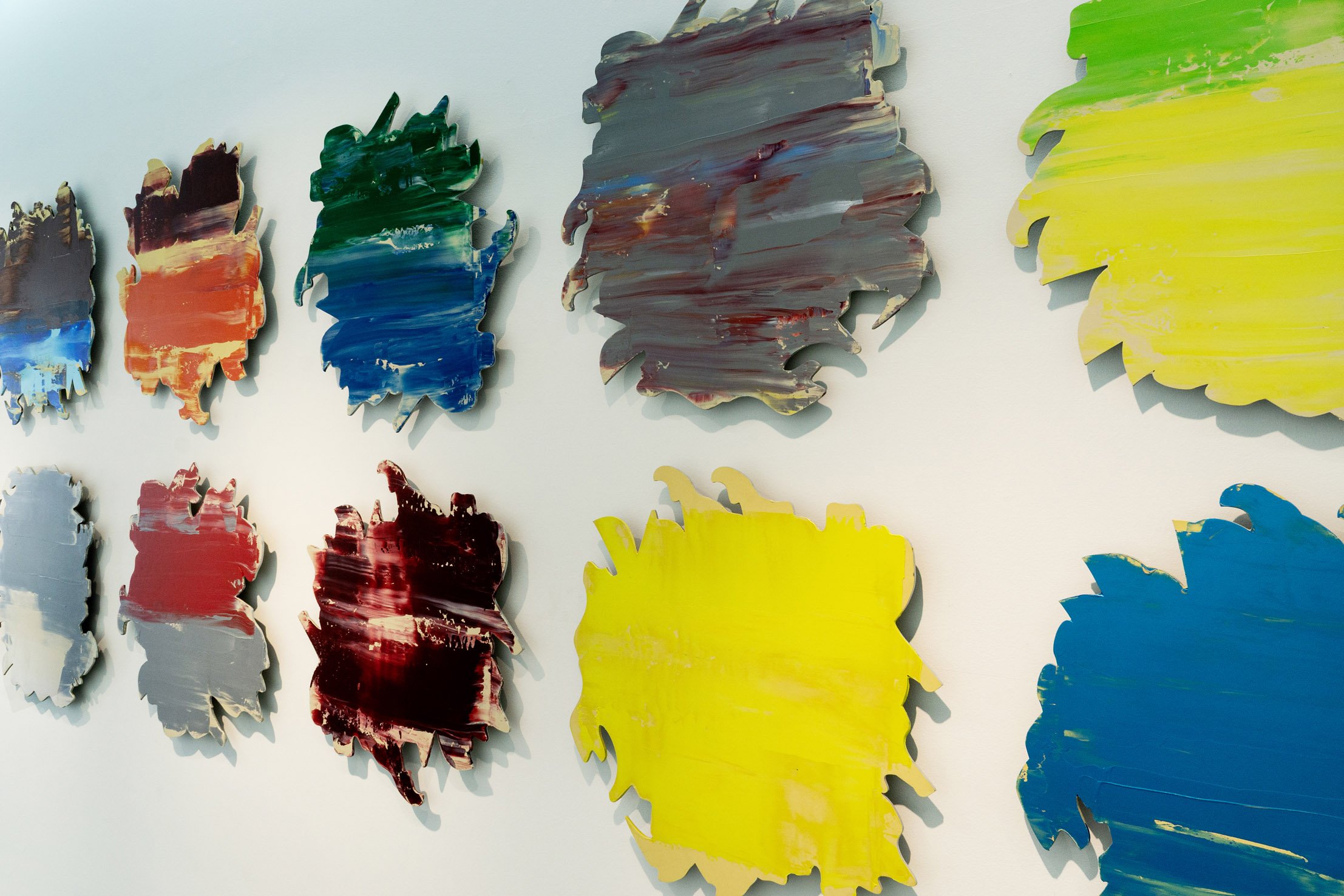
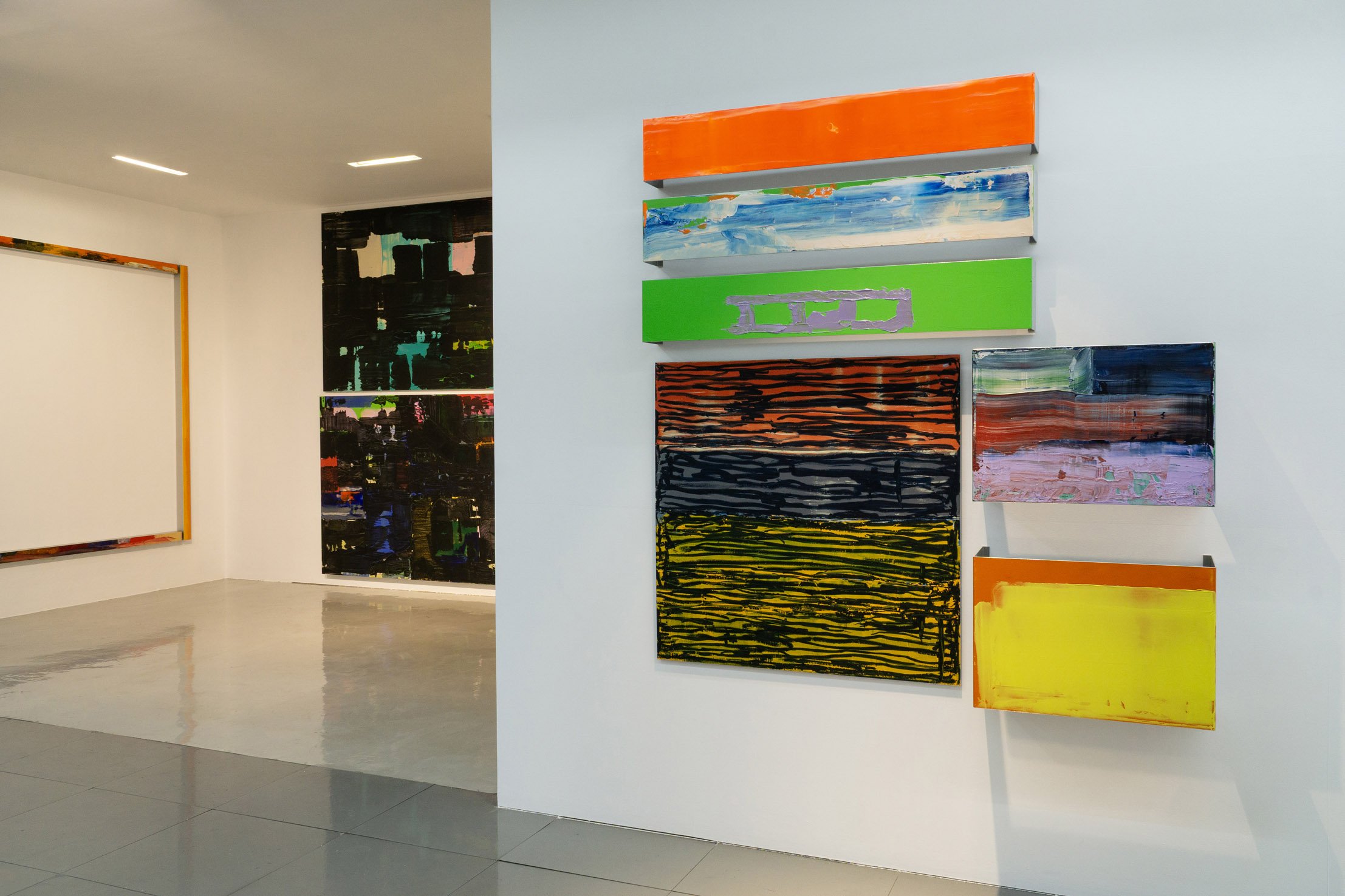
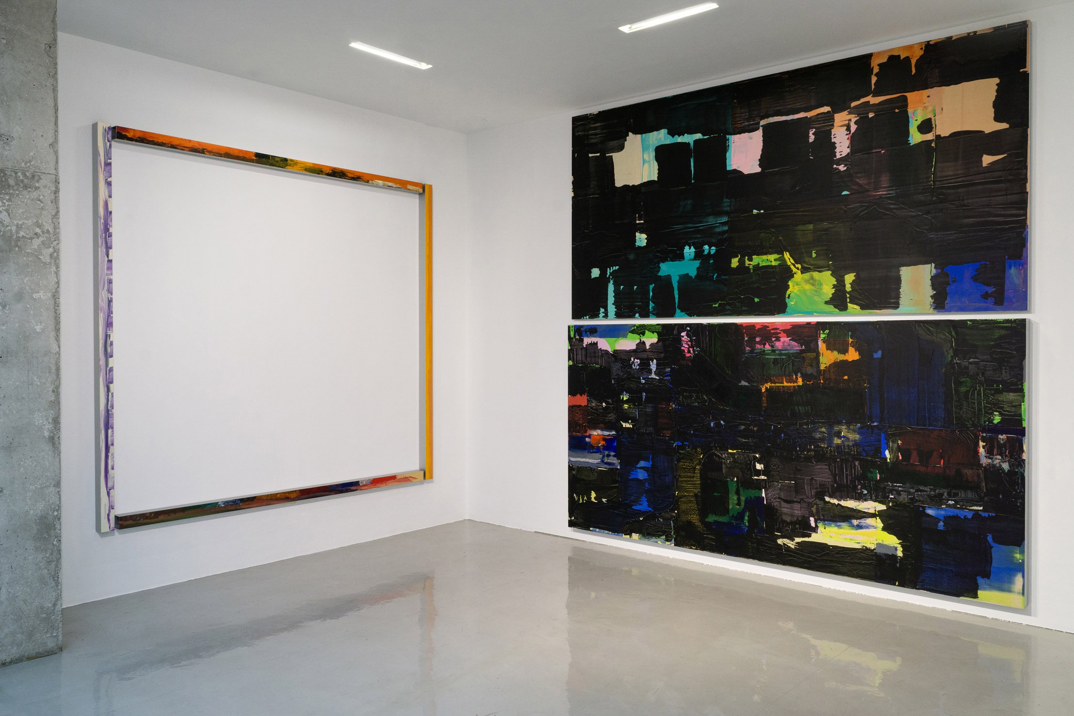
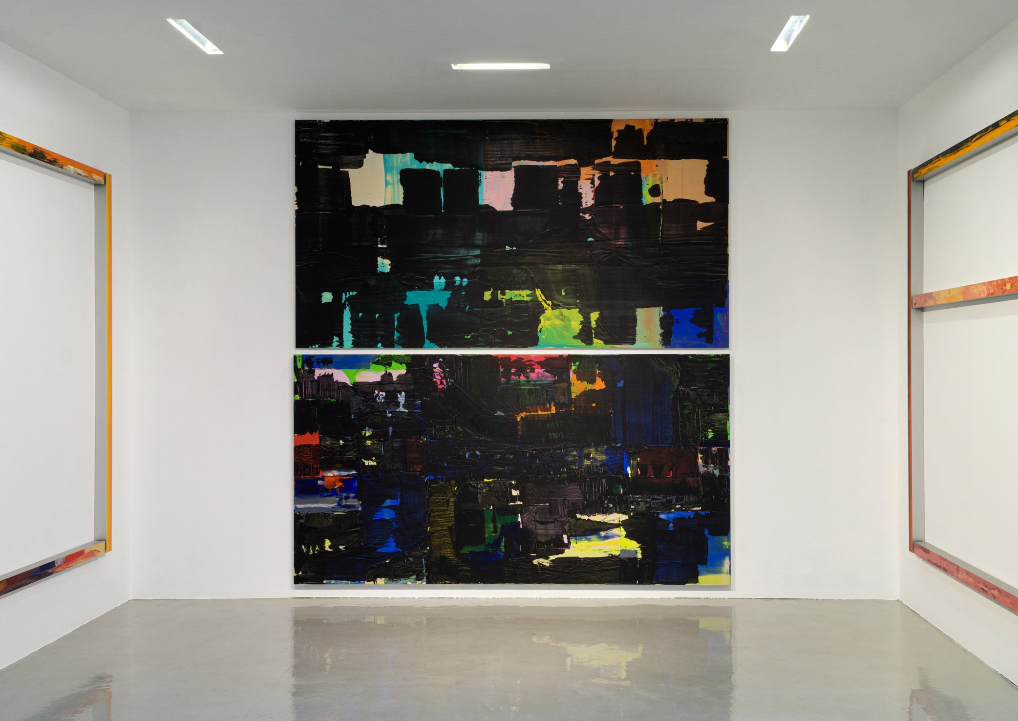
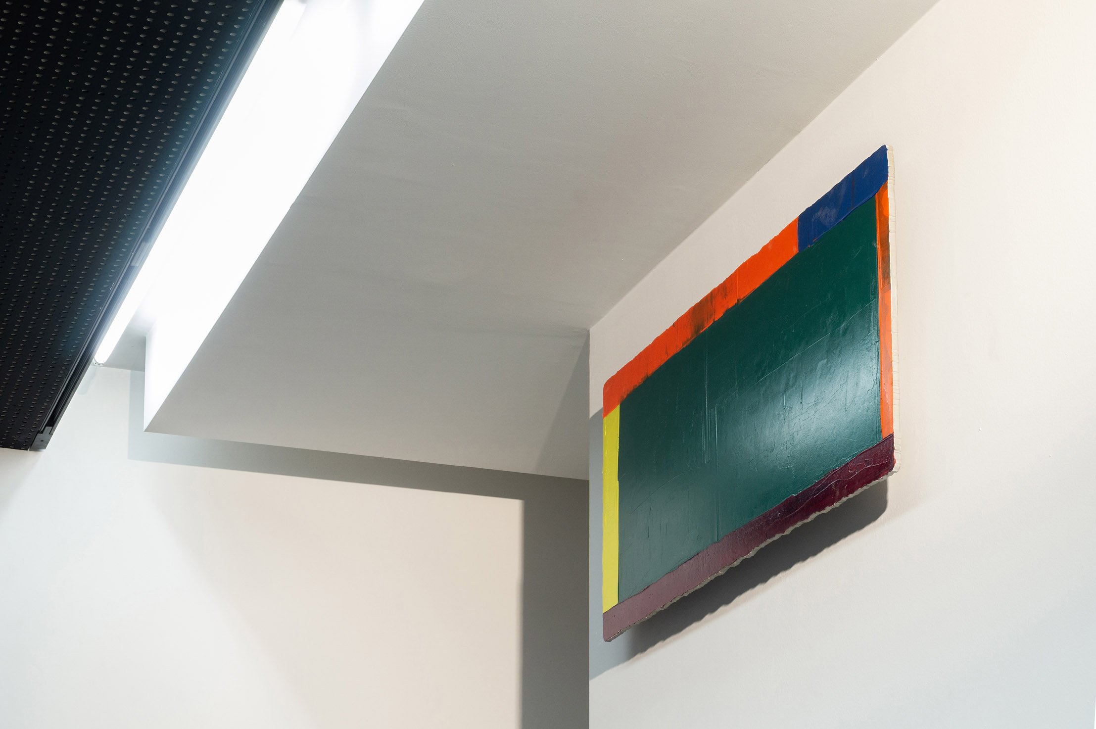
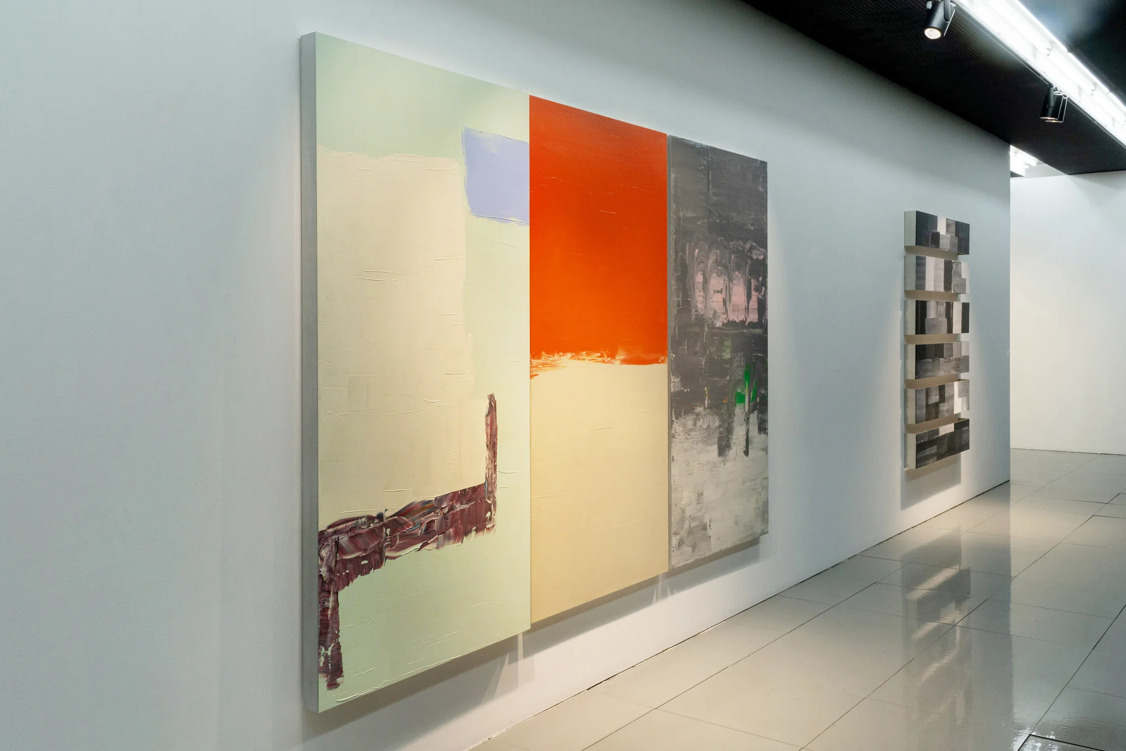
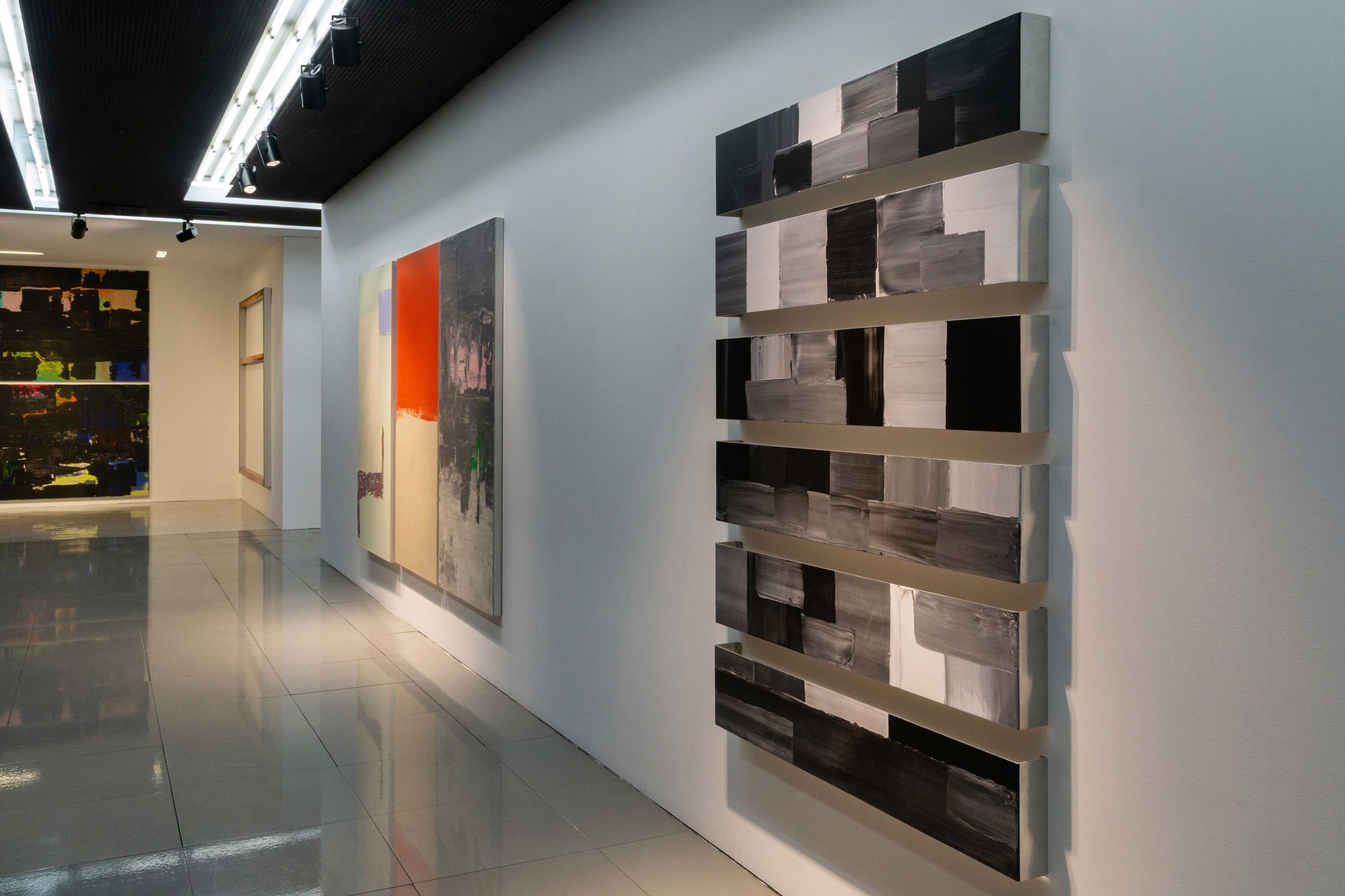
The group of works selected by myself and Helena Mendes Pereira for the “Border” exhibition consisted
of 23 works created between 2005 and 2024.
Some of the works are made up of panels – acrylic or oil paintings on aluminium – which are organised
according to predetermined placements and show different approaches to the concept of fragment
and the limits of painting. An important development for this type of work came in 1995, with the
exhibition “Involuntary Memory” at the Chiado National Museum of Contemporary Art.
The formal and conceptual approach to the act of fragmenting is expressed in different ways. It all has
to do with how I observe what I see, how my gaze focuses on certain details rather than on the whole
picture. It’s as if I avoid the desire for a conclusion, to affirm the work by synthesising what it could be. I
don’t know if it all started many years ago, when I was about 10 years old and came across various comic
book collections, particularly the magazine Mosquito and the Cavaleiro Andante, or a very popular
series among us, the magazine Falcão, in which Major Alvega, the Portuguese aviator hero of the Second
World War, invariably performed aerial feats by destroying countless German Messerchmit squadrons
with the mythical “Spitfire”. The fact is that reading the so-called cartoons developed in me a taste for
this type of illustrated drawing. I would read them behind my mum’s back, a real iconoclast of this
type of publication, as she considered it, rightly or wrongly, to be inferior literature, not comparable
to the great novels, which she would discreetly put down on my bedside table to motivate me. For her,
picture books with well-structured arguments would develop my imagination and my interest in images.
Enid Blyton’s “The Famous Fives” books, Jules Verne’s marvellous illustrated books and then so many
others, such as Aquilino Ribeiro’s “Romance da Raposa”, José Mauro de Vasconcelos’ novels and Saint
Exupery’s “The Little Prince” (which made me discover his nocturnal flights), ended up adding to my
beginner’s view of the world, but the fact is that I never lost my fascination with comics.
So it was only natural that, when I was 19 years old and the desire to learn to draw and photograph
became apparent, my first experiences went along with this notion of a visual story, which unfolds in the
details of each “little square”, motivating and stimulating the eye. At the time (1971/82) I used coloured
pencils and markers, crossing and overlapping lines and then filling in the resulting shapes with different
colours. In this way, I created spatial patterns, undulating planes, only limited in their extent by the
boundaries of the sheet of paper or the cardboard board I used to paint on. At the time, I had seen some
reproductions of paintings by Victor Vasarely – the first book in my art library, bought at Christmas
1970 – or the black and white reproductions in a dictionary of painting organised by Leonello Venturi,
and I was particularly interested in Giotto’s frescoes. I learnt then that this was the artist who made a
perfect circle by the uninterrupted movement of his hand, without any support, as Vasari tells us in his
text “Lives of the Most Excellent Painters, Sculptors and Architects”, 2nd edition, 1568. I really liked the
heavy rocks and the compressed space between the characters, as if the action was all concentrated in the foreground, leaving the background to the rocky mountains. And this is exactly what happens in some
comic strips, where the outline of the flat patches of colour by the fine lines of the drawing cause the
planes of the representation to separate.
The fragment is as follows: reference to environments, inhabited by different characters; the act
of partially copying these backgrounds, ignoring the characters and emphasising aspects of their
architecture, already looking for what the image hides; the placement of contradictory details side by
side, discussing the atmospheric and conceptual sequence of the pictorial surface. This gave rise to spaces with no history, so often redesigned and repeated, in which the eye learned to
move around, discovering other stories, the images where the imagination that dialogues with lines and
colours will develop.
It wasn’t until 1996, when I was preparing the aforementioned “Involuntary Memory” exhibition and
then the following exhibition, “Field of Shadows”, for the Pilar and Joan Miró Foundation in Mallorca,
that I realised how, by constructing elaborate backgrounds and using simple contour drawings, I could
achieve unexpected movements in the process of creating images. An intricate overlapping of strokes
in different colours led to ideas that were only tackled a year and a half later, in which the drawing
incorporated houses, objects and trees, only to undo them in the overlapping and blending of the masses
of spattered paint that he placed on the surface of the support. Thus began the abstract paintings, which
I grouped into grids of multiple elements and organised like a comic strip, making the eye jump from
shape to shape, from colour to colour, in search of a new logic, of a story that couldn’t be found there.
Grounds – Chãos – Bases – Escalas de cores – Topographic Charts – Topografias – Badges – Brazões –
Emblemas – Blocos – Barreiras – Flutuantes – Imaginar casas – Livros – Sitiados – Hit the Road – Põe-te a
caminho – Tracções e Compressões – Trevo da Sorte – Bartleby – Mil pinturas – Mundos laterais.
These are some of the titles of the works in the “Border” exhibition at zet gallery. The themes of space
and movement have run through my work over the years. They are subjects that determine the gaze, but
they are also, in an overall view, a poetic construction that takes its place in the process of making.
I recently read a text on Benglis (Lynda Benglis (1941-). This artist is mentioned here because I enjoy
her works in sculpture and painting and, on the other hand, her boldness and shamelessness, which
is decidedly provocative. But, above all, as an example of a dual practice, in her case both formal and
eminently political and gendered.
Essentially, I repeat ideas of nature and I process them and interpret them, Benglis said in a short
documentary produced by Art21 in 2015.
I ask if the making of the thing is as important as the thing made. They’re one and the same, she says.
(Benglis, interview for Frieze magazine, 2012)
There is Benglis the sculptor, an artist delighting in pure abstractions of colour, shape and form, whose
works provoke sheer pleasure – the way a child might love the sight of green slime or squished berries.
Then, there is Benglis the provocateur, a statement-maker hyperliterate in the charged signifiers of
gender and power. This is the auteur of the notorious 1974 Artforum advertisement, that cultural
touchstone of a photograph, in which Benglis, wearing only white-rimmed cat-eye sunglasses, oiled
and tanned but for the white triangular marks of a bikini, fullbushed, hips thrust, appears to penetrate
herself with a sizeable double-ended dildo. (Lynda Benglis – Pours One Out, by Hermione Hoby, Frieze
Magazine 209, 2012).
Her sculpture, openly multi-coloured, naturally coexisted with her provocative and political works,
about gender and power. I revisited this 1974 work in Barcelona a while ago: a photograph in which she
portrays herself naked with a dildo, exposing how certain gazes perceive women, a work that continues
to provoke the viewer. In it. she exposes gender issues, the masculine and the feminine (but also their
inverse). Contested by feminists as well as eminent art critics, her attitudes revealed the fairness and
ambiguity of the issues she raised. On the other hand, from her ceramic, painting and sculpture works,
I retain overwhelming abstract volumes, spills of paint on the floor, revealing unexpected connections
between painting and sculpture.
Her “paint spills” and wall or floor sculptures, whether monochrome or multicoloured, influenced a
number of artists who experimented with the transition from painting to other dimensions, discussing
the evolution of the painting as a window to the painting that invades the viewer’s space. In the 2000s
there was talk of “expanded painting”, which can be seen, for example, in some of Frank Stella’s late work
or in Catherine Gross’s paintings and installation-paintings.
In my early works (1972-76), abstract paintings and drawings coexist with photographic series, where
the politicised, but not gendered, attitude is evident.
At the time, I was rethinking the way I positioned myself politically in society and, in parallel, the way
I looked at myself, how I would define my artistic practice, developing intimate works, around the
landscape and the figure, in the solitary work of the studio.
Adapting from the processes of Noronha da Costa, or the impressive hills and mountains of João
Hogan, confronting the raw brutality of the materials of the minimalists, trying to work in the
blacks of the intense and crushing plates and drawings of Richard Serra, the study of scenographies
or environments that provoke the instability of the spectator, as in Bob Wilson’s environments or El
Lissitzky’s devices or James Turrell’s installations, abstraction and questions around the ways and times
of looking, space and its representation, in its staticity and movement, time, in the deception of its not
passing, constitute paths in my work, in the obsessive search for truth and freedom.
I think that the practice of the visual arts is steeped in dualities and contradictions where the awareness
of freedom, which the artist demands, is always made explicit in nebulous transparency. The artist’s
work, his research, exists in the impossibility of submitting to any norms or programme ideals.
On the face of the earth,
Over the face of the earth.
The petrifactions of the body
The world of the invisible
Veils, nebulous transparency
One and the same thing
Another and its remains
Certain colours have some information
Ideas of nature are repeated,
The colours that make sense
And the rest
I define myself
A guide to possible realms
Two and multiple dimensions
Systems for depicting reality
Folding and refolding
From the corner
Down the street
On the road
Inside the house
We’ve arrived
Pedro Calapez
[PT]
Luz na meia sombra
por Pedro Calapez
Luz, sombra, como se caminhássemos entre esses dois extremos em que uma obra resvala ou se revela, um sistema de enunciados programáticos num interminável vaivém. Não vou ser claro, não o quero ser. Quero deixar à pintura a possibilidade de enganar, a oportunidade de não dar a resposta que o olhar deseja, a certeza de que pode ser outra coisa do que aquela que as formas e cores aparentam ser. Quando se fala de luz deparamo-nos com algo de pouco concreto, algo que não nos diz se a luz é de um branco intenso, num contraste vigoroso com uma (qualquer) outra cor, ou apenas o suave aclarar duma penumbra. Mas porque é que a noção de contraste é sempre tão determinante no objecto artístico?
Outros pares de opostos são úteis no meu trabalho. Parece ser um processo que não só me ajuda a revelar um trabalho que num momento dei como terminado, como conduz a processos de aferição, pondo tudo em causa.
O conjunto de obras selecionadas, por mim e pela Helena Mendes Pereira, para a exposição “Fronteira”, recaiu sobre 23 obras realizadas entre 2005 e 2024.
Algumas são obras constituídas por painéis – pinturas a acrílico ou óleo sobre alumínio – que se organizam segundo colocações pré-determinadas e que evidenciam diferentes aproximações ao
conceito de fragmento e aos limites da pintura. Um importante desenvolvimento para este tipo de
trabalho situo-o em 1995, com a exposição “memória involuntária“, no Museu Nacional de Arte
Contemporânea-Museu do Chiado.
A abordagem formal e conceptual do acto de fragmentar expressa-se de diferentes modos. Tudo tem
a ver como observo o que vejo, como o meu olhar se prende em determinados detalhes mais do que
na visão de um todo. É como se evitasse a vontade de uma conclusão, de afirmar a obra sintetizando o
que esta poderia ser. Não sei se tudo começou há mesmo muitos anos, quando pelos meus 10 anos me
chegaram à mão diversas colecções de banda desenhada, nomeadamente a revista Mosquito e o Cavaleiro Andante, ou uma série muito popular entre nós, a revista Falcão, onde invariavelmente o Major
Alvega, herói aviador português na segunda Guerra Mundial, realizava proezas aéreas destruindo, com
o mítico “Spitfire”, inúmeras esquadrilhas de Messerchmit alemães. O que é um facto é que a leitura
dos chamados desenhos aos quadradinhos desenvolveram em mim o gosto por este tipo de desenho
ilustrado. Lia às escondidas de minha mãe, verdadeira iconoclasta deste tipo de edições, pois considerava, com (ou sem) razão, se tratar de uma literatura inferior, não comparável aos grandes romances, que pousava discretamente, para me motivar, na minha mesa de cabeceira. Para ela os livros sem imagens com argumentos bem estruturados, seriam o que desenvolveria a minha imaginação e o meu interesse pelas imagens. Dos livros “dos cincos” de Enid Blyton, os ilustrados e maravilhosos livros de Júlio Verne e depois tantos outros, como o Romance da Raposa de Aquilino Ribeiro, ou as novelas de José Mauro de Vasconcelos e o Principezinho de Saint Exupery (que me fez descobrir os seus nocturnos voos), acabaram por se juntar ao meu principiante olhar do mundo, mas o facto é que nunca perdi o fascínio pela banda desenhada
Foi assim natural que, pelos meus 19 anos, revelando-se a vontade de aprender a desenhar e a fotografar, as primeiras experiências percorressem essa noção de história visual, que se desenrola nos pormenores de cada “quadradinho” motivando e estimulando o olhar. Utilizava então (1971/82) lápis de cores e marcadores, cruzando e sobrepondo linhas para depois preencher as formas resultantes com diferentes cores. Criava assim padrões espaciais, planos ondulantes, só limitados na sua extensão pelos limites da folha de papel ou da prancha de cartão que usava para pintar. Teria visto por essa altura algumas reproduções de pinturas de Victor Vasarely – o primeiro livro da minha biblioteca de arte, comprado no Natal de 1970 -, ou as reproduções a preto e branco, de um dicionário da Pintura, organizado por Leonello Venturi, tendo-me especialmente fixado nos frescos de Giotto. Aprendi então que era o tal artista que realizava um círculo perfeito pelo movimento interrupto da sua mão, sem qualquer apoio, como conta Vasari no seu texto “Vidas dos Mais Excelentes Pintores, Escultores e Arquitetos”, na 2ª edição, em 1568. Apreciava sobremaneira as pesadas rochas e o espaço comprimido entre as personagens, como se a acção se concentrasse toda nos primeiros planos, deixando os fundos para as rochosas montanhas. E é exactamente o que se passa nalgumas bandas desenhadas, em que o contorno das planas manchas de cor pelas finas linhas do desenho, provocam a separação dos planos da representação.
O fragmento é assim: referência aos ambientes, habitados por diferentes personagens; o acto de copiar
parcialmente esses fundos, ignorando as personagens e enfatizando aspectos das suas arquitecturas,
procurando já o que a imagem esconde; a colocação lado a lado de pormenores contraditórios, discutindo a sequência atmosférica e conceptual da superfície pictórica.
Surgiram assim espaços sem história, tantas vezes redesenhados e repetidos, em que o olhar aprendeu a deslocar-se, descobrindo as outras histórias, as imagens onde se irá desenvolver o imaginário que dialoga com linhas e cores.
Foi só em 1996, quando preparava a referida exposição “memória involuntária” e depois na exposição
seguinte, “Campo de Sombras”, para a Fundação Pilar e Joan Miró, em Maiorca, que me apercebi
como, pela construção de elaborados fundos e usando simples desenhos de contorno, poderia atingir
movimentações inesperadas no processo de criação de imagens. Uma intricada sobreposição de traços de diferentes cores, conduziram a ideias só abordadas um ano e meio depois, em que o desenho incorporou casas, objectos, árvores para logo os desfazer, na sobreposição e mescla das massas de tinta espatulada que colocava na superfície do suporte. Começaram assim as pinturas abstractas, que agruparei em grelhas de múltiplos elementos, e que organizei como uma banda desenhada, fazendo o olhar saltar de forma em forma, de cor em cor, na procura de uma nova lógica, de uma história que lá não se encontraria.
Grounds – Chãos – Bases – Escalas de cores – Topographic Charts – Topografias – Badges – Brazões –
Emblemas – Blocos – Barreiras – Flutuantes – Imaginar casas – Livros – Sitiados – Hit the Road – Põe-te a
caminho – Tracções e Compressões – Trevo da Sorte – Bartleby – Mil pinturas – Mundos laterais.
São alguns dos títulos das obras da exposição “Fronteira” na Zet Gallery. Os temas, espaço e movimento,
percorrem o meu trabalho ao longo de anos. São assuntos que determinam o olhar, mas são também,
numa visão de conjunto, uma construção poética que toma o seu lugar no processo do fazer.
Li há pouco um texto sobre Benglis (Lynda Benglis (1941-). Esta artista é aqui evocada porque gosto
do seu trabalho em escultura e pintura e por outro lado, o seu arrojo e despudor, decididamente
provocatório. Mas, acima de tudo, como exemplo de uma prática dupla, no seu caso, ora formal ora
eminentemente política e de género.
“Essencialmente, repito ideias da natureza, processo-as e interpreto-as”, disse Benglis, num curto
documentário produzido pela Art21, 2015.
“Pergunto se a criação da coisa é tão importante quanto a coisa criada. ‘São uma e a mesma coisa’, diz”
(Benglis, entrevista para a revista Frieze, 2012).
“Existe Benglis a escultora, uma artista que se deleita em abstrações puras de cor, forma e formato, cujas
obras provocam puro prazer – do mesmo modo como uma criança poderia gostar de lodo verde ou
de bagas esmagadas. Depois, há Benglis a provocadora, uma criadora de declarações profundamente
versadas em signos carregados de género e poder. Esta é a autora do famoso anúncio na revista Artforum (1974), a fotografia, em que Benglis, usando apenas óculos de sol com aro branco, estilo gato, oleada e bronzeada exceto pelas marcas triangulares brancas de um biquíni, com a púbis à vista, quadris
projetados, parece penetrar-se com um substancial dildo de duas pontas”. (Lynda Benglis – Pours One
Out, por Hermione Hoby, Revista Frieze 209, 2012).
A sua escultura, assumidamente multi-colorida, coexistiu naturalmente com as suas obras de raiz
provocatório e político, sobre género e poder. Revi há tempos, em Barcelona, a referida obra de 1974:
uma fotografia em que se autorretrata nua, com um dildo, expondo como certos olhares pensam a
mulher, uma obra que continua a provocar o espectador. Nela expõe questões de género, o masculino
e o feminino (mas também o seu inverso). Contestada pelas feministas assim como por eminentes
críticos de arte, as suas atitudes vieram revelar a justeza e ambiguidades das questões que levantava. Por outro lado, das sua obras em cerâmica, pintura e escultura, retenho esmagadores volumes abstractos, derramamentos de tinta pelo chão, revelando conexões inesperadas entre a pintura e escultura.
Os seus “derrames de tinta” e esculturas de parede ou de chão, monocromáticas ou multicoloridas,
influenciaram diversos artistas que experimentavam a passagem da pintura para outras dimensões,
discutindo a evolução do quadro como janela para o quadro que invade o espaço do espectador. Nos
anos 2000 falou-se de “pintura expandida”, o que se pode contatar, por exemplo, nalgum do trabalho
tardio de Frank Stella ou nas pinturas e pinturas-instalação de Catherine Gross.
No meu trabalho inicial (1972-76), pinturas e desenhos abstractos coexistem com séries fotográficas,
onde a atitude politizada, mas não de género, é evidente.
Repensava nessa altura o modo como me posicionava politicamente em sociedade e em paralelo, o modo como me olhava, como definiria a minha prática artística, desenvolvendo obras intimistas, em torno da paisagem e da figura, no trabalho solitário do atelier.
Adaptando dos processos de Noronha da Costa, ou os impressionantes montes e montanhas de João
Hogan, enfrentando a brutalidade crua dos materiais dos minimalistas, procurando trabalhar nos negros
das intensas e esmagadoras chapas e desenhos de Richard Serra, o estudo de cenografias ou ambientes
que provocassem a instabilidade do espectador, como nos ambientes de Bob Wilson ou nos dispositivos
de El Lissitzky ou ainda nas instalações de James Turrell, a abstracção e as questões em torno dos modos e tempos do olhar, o espaço e a sua representação, na sua estaticidade e movimento, o tempo, no engano do seu não passar, constituem caminhos no meu trabalho na obsessiva procura da verdade e da liberdade. Penso que a prática das artes visuais se embebe de dualidades e contradições onde a consciência da liberdade, que o artista exige, sempre se explicita em nebulosa transparência. O trabalho do artista, a sua investigação, existe na impossibilidade de submissão a quaisquer normas ou ideários programáticos.
À face da terra,
Sobre a face da terra.
As petrificações do corpo
O mundo dos invisíveis
Véus, a nebulosa transparência
Uma e a mesma coisa
Outra e os seus restos
Certas cores têm alguma informação
Repetem-se ideias de natureza,
As cores que fazem sentido
E as outras
Defino-me
Guia para mundos possíveis
As duas e múltiplas dimensões
Sistemas para representar a realidade
Dobra e redobra
Desde a esquina
Pela rua
No caminho
Dentro de casa
Chegámos
Pedro Calapez
